The Florida Marlins are Dead. Long Live the Miami Marlins!
It's been known for a few weeks now that starting in the 2012 season, the Florida Marlins would be changing their name to the Miami Marlins. Initially, the reason the Marlins claimed the state as their location was because they were the first professional baseball team in Florida and tried to get state-wide appeal in a state that does not traditionally care about sports other than football, despite having a very large Cuban community.
The Florida Marlins have actually been a pretty successful team in their short history, winning 2 World Series titles, which is far more than the 0 titles won by the Padres, Rangers, Astros, Brewers, Mariners, and Nationals, who are all at least 20 years older. The Marlins have also accomplished an incredibly rare feat: they have only qualified for the playoffs twice. In case you can't put 2 and 2 together, that means that so far, the Marlins have never lost a playoff series.
The reason the Marlins are rebranding themselves is because of their stadium which is a far more modern facility. Their colors do make sense, blue for the ocean, yellow for the beaches, and orange for the sunset, but goddamn those colors together are ugly as sin and remind me of such eyesores like the Denver Broncos' orange jerseys and the Houston Astros orange and yellow striped jerseys from the 80s. Thankfully, we won't be subjected to ugly ass jerseys very much.
This is their full slot of jerseys. The Home and Away jerseys are actually really great and are similar to the Giants' jerseys. Their Alt 1 jersey is just plain blinding and reminds me again of how awful the Giants' alternate orange jerseys are. The Alt 2 and BP jerseys are also surprisingly good looking, so their color scheme isn't totally stupid looking on a jersey. Their caps, however, are a different story.
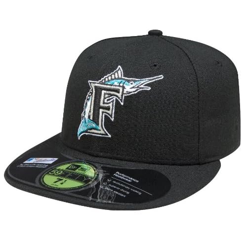
This is where their new logo really shows off as being horrible looking. For reference, this is what the old cap looked like:
The logo was nice and the coloring was great on a black cap. The new logo just doesn't work with a black cap and especially with that ugly all-orange cap. The new caps do preserve the old look of the Florida Marlins cap with the marlin facing right next to the letter, but honestly this was an opportunity for the Marlins' cap to just be an M in the team colors.
Well whatever, the Marlins have only become a more colorful team to be annihilated by the Giants next year.


No comments:
Post a Comment